Scaling design systems for accessibility with Johnson & Johnson
Role
Design systems
Accessibility
Industry
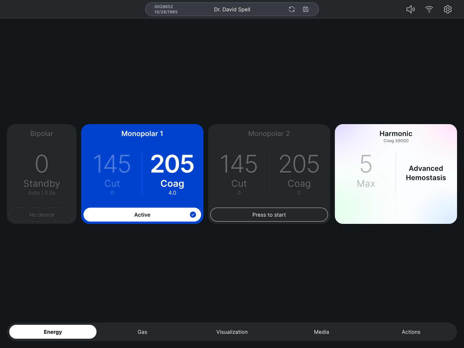
Healthcare
Timeline
3 months
The challenge
Johnson & Johnson's Figma component and icon libraries were used across multiple digital teams but had become fragmented over time. Components were inconsistent, documentation was limited, and accessibility standards were unevenly applied.
The project goal was to unify and modernize the design system to create a single, accessible resource that could be adopted across teams and scaled for future use.
System audit
I began by auditing existing libraries to identify inconsistencies and opportunities for improvement. There were components that had duplicate variations, inconsistent naming conventions, and interactive states that were poorly documented.
Visual inconsistencies between components created a misalignment across design patterns with several components failing to meet WCAG accessibility standards. This audit became the foundation for our consolidation and standardization efforts.
Design priorities
Pilots valued DDR’s potential but needed usability improvements before they could fully rely on it. Our research revealed four design priorities:
- Consistency: Consolidate duplicate components and standardize naming, spacing, and hierarchy.
- Accessibility: Many patterns failed WCAG color contrast or lacked clear focus states
- Scalability: A grid-based foundation that could adapt to future needs
Grid and scaling
A 4px baseline grid was applied to all components to maintain visual harmony and proportionality. This ensured consistent spacing, scalable typography, and alignment across elements, making layouts predictable and easy to implement.
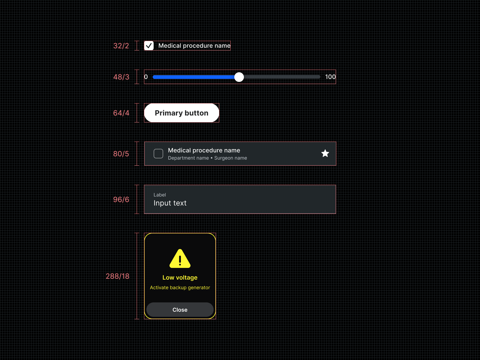
Accessible by design
Accessibility was integrated into every component. Colors were adjusted for contrast, type scales were reviewed for legibility, and interactive states were clearly defined. By embedding accessibility into the foundation, all future designs built from the system are inclusive by default.
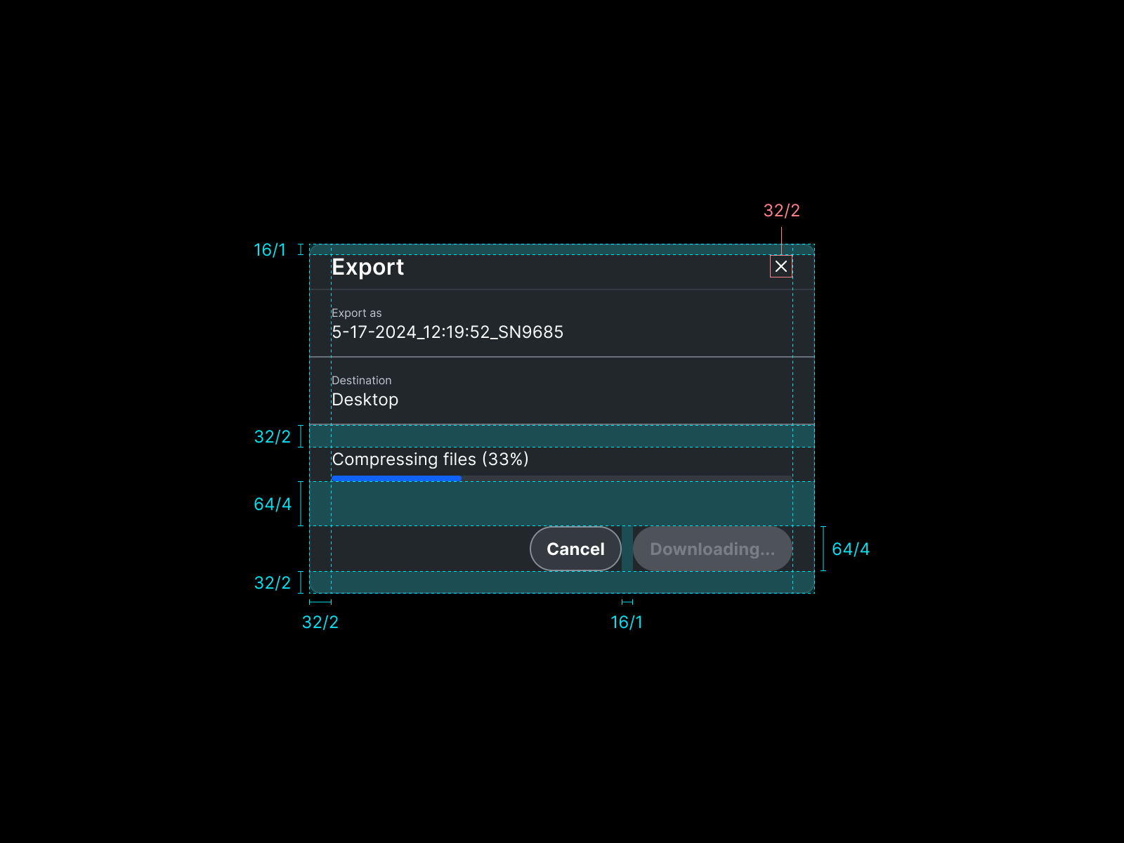
Workflow optimization
Using Figma’s latest features, I organized components with variants, auto layout, and conditional logic. Interactive states like hover, active, and toggle were fully documented, and notes were included directly in Figma to guide designers and developers. This reduced duplication, accelerated template building, and encouraged adoption across teams.
Impact
We successfully merged multiple design systems into a single, accessible resource. Designers and developers now work from a unified source of truth, accessibility is built in by default, and adoption across teams has increased. The system provides a scalable foundation for future projects while reducing inconsistencies, design debt, refactoring.
"Chris' quality of work and commitment to the project timeline, and the satisfaction of the end users was top notch. He's a talented and highly capable designer."
Final thoughts
This project reinforced the importance of precision, accessibility, and scalability in design systems. Clear documentation, shared knowledge, and accessible patterns can have a large impact on adoption and workflow efficiency. Moving forward, I would focus more on measuring adoption metrics and gathering direct feedback from contributors to further optimize the system.